![IMG.LY_logo_black_blue (1)-1.png]](https://support.img.ly/hs-fs/hubfs/IMG.LY_logo_black_blue%20(1)-1.png?height=44&name=IMG.LY_logo_black_blue%20(1)-1.png)
The Creative Editor ships with a fully customizable UI, allowing you to turn it into a native part of your app. You have three options to choose from, you can use one of the built-in out-of-the-box themes; quickly and easily adjust the visual aspects of the editor with themes options; or create a more detailed theme customization thanks to our theming API.
Theming options allow you to quickly adjust elements such as scaling, theme, background, active, and accent.
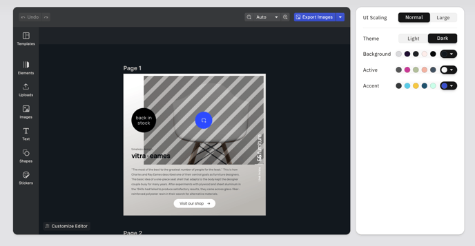
Scaling
UI scaling controls the size of the navigation panel and icons, allowing you to choose a better match depending on your users and their preferred devices. You can choose between Normal and Large, with Normal applied as a default setting. Large scaling can be useful for improving readability based on a device, and provide a better experience for users with slights visual or motor impairments.
Theme
Theme automatically switches the editor’s layout to the classic Light or Dark mode view, covering the defaults offered by most operating systems and apps. The Dark mode is applied by default.
Background, Active & Accent
Additionally, you can choose a custom background, active, and accent color with a color picker tool or by inputting Hex Color Code. You can change every element of the editor to match your branded colors or customize just one element to make it stand out, like the accent color of the export button.
👉 Showcase